Next.js 13 has brought in several new features that enhance the developer experience. In this article, we'll delve into how to effectively integrate the Context API in a Next.js 13 app, focusing on a real-world example: a Dark Mode Toggle.
Understanding the Context API in Next.js 13
Context provides a way to pass data through the component tree without having to pass props down manually at every level.
Setting up the Dark Mode Context
Our goal is to have a global toggle that switches the theme of our app between dark and light modes.
1. Define the Context:
In ThemeContext.ts, we define and export the context. We also set up a default context which is beneficial for type safety and understanding the shape of our context:
import { Dispatch, SetStateAction, createContext } from "react";

export interface ContextType {
  darkMode: boolean;
  setDarkMode: Dispatch<SetStateAction<boolean>>;
}

const defaultContext: ContextType = {
  darkMode: false,
  setDarkMode: (status: SetStateAction<boolean>): void => {},
};

export default createContext<ContextType>(defaultContext);
2. Create a Provider Component:
The ThemeProvider.tsx serves as the component wrapping parts of our app where we want the theme data accessible:
"use client";
import { ReactNode, useState } from "react";
import ThemeContext from "./ThemeContext";

export const ThemeProvider = ({ children }: { children: ReactNode }) => {
    const [darkMode, setDarkMode] = useState<boolean>(false);
    return (
        <ThemeContext.Provider value={{ darkMode, setDarkMode }}>
            {children}
        </ThemeContext.Provider>
    );
};
3. Accessing the Context:
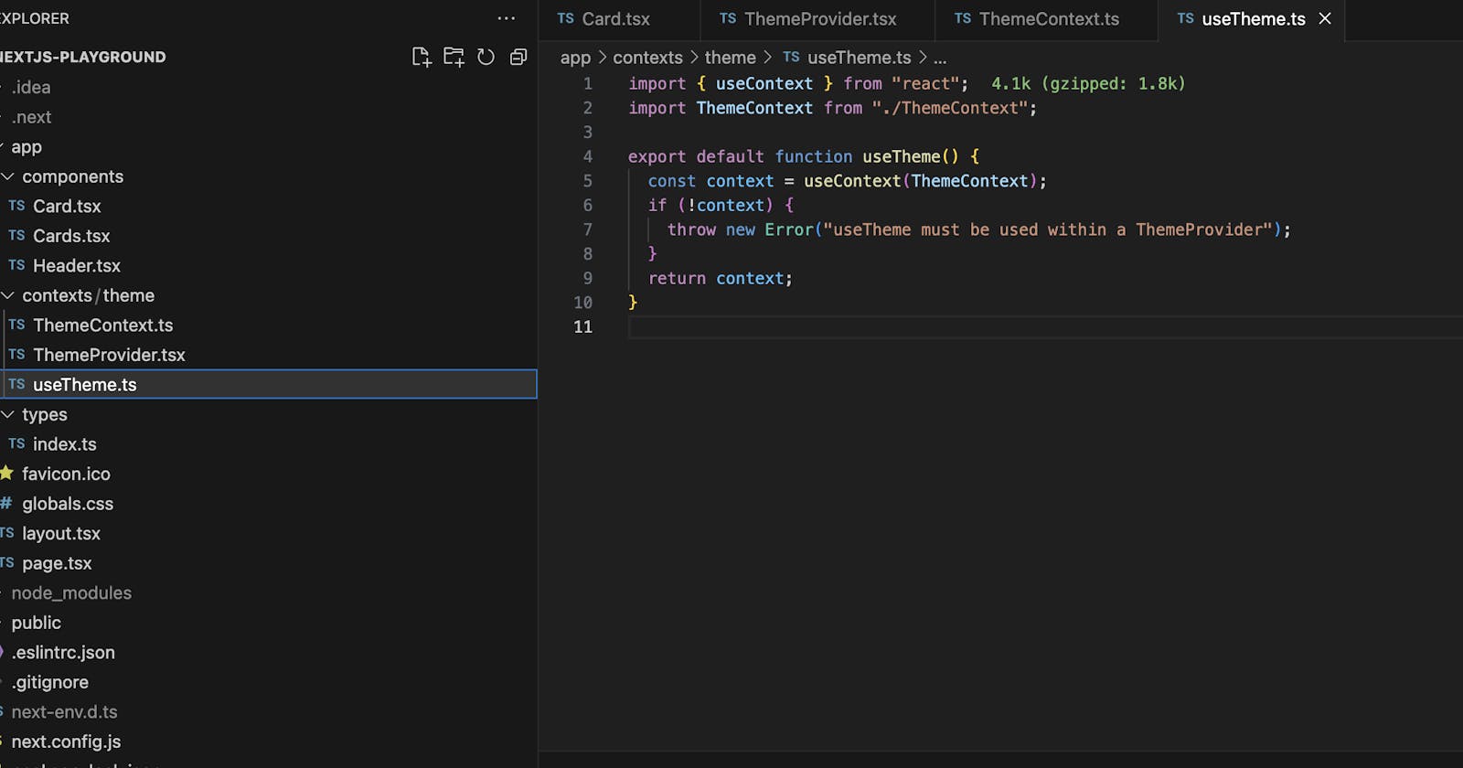
For better abstraction and error handling, we create a custom hook named useTheme.ts. This hook abstracts the context retrieval and provides a clear error message if used outside the provider:
import { useContext } from "react";
import ThemeContext from "./ThemeContext";

export default function useTheme() {
  const context = useContext(ThemeContext);
  if (!context) {
    throw new Error("useTheme must be used within a ThemeProvider");
  }
  return context;
}
Implementing the Dark Mode Toggle
Header Component: The Header.tsx component contains a button to toggle between the dark and light modes:
"use client";
import useTheme from "@/contexts/theme/useTheme";

const Header = () => {
  const { darkMode, setDarkMode } = useTheme();
  const className = darkMode ? 'bg-black text-white' : 'bg-white text black'
  return (
    <header className={`${className} h-20 flex items-center px-5 border-b`}>
      <button onClick={() => setDarkMode(!darkMode)}>Toggle Dark Mode</button>
    </header>
  );
};

export default Header;
Card Component: The Card.tsx component adjusts its appearance based on the current theme:
"use client";
import useTheme from "./contexts/theme/useTheme";

interface Props {
  title: string;
  description: string;
}

const Card = ({ title, description }: Props) => {
  const { darkMode } = useTheme();
  const className = darkMode ? 'bg-black text-white' : 'bg-white text black'
  return (
    <div className={`p-6 rounded shadow-lg rounded-lg ${className}`}>
      <h2 className="text-xl font-bold mb-2">{title}</h2>
      <p>{description}</p>
    </div>
  );
};


export default Card
Best Practices:
Separation of Concerns: Separate the context creation, provider, and custom hooks into different files for better readability and maintenance.
Use Custom Hooks for Abstraction: Abstract the context retrieval logic into a custom hook (like
useTheme). This makes the context easier to use and provides better error handling.Type Safety with TypeScript: Define the shape of your context using TypeScript. This makes your code more robust and less error-prone.
Conclusion
By integrating the Context API with Next.js 13, we can efficiently handle global states like themes. Using best practices ensures that your app remains scalable, maintainable, and less error-prone. The Dark Mode example provides a practical implementation, showcasing the power of combining Next.js 13 features with the React Context API.
You can review the full code from here: https://github.com/mustafadalga/nextjs-playground/tree/context-api
